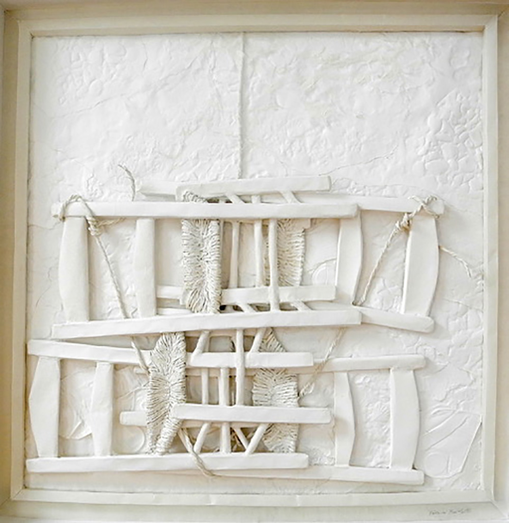
| WHITE
I think of a sheet of white paper as a piece of material light.
White reflects light, making it the brightest of colours.
Many of my images are in relief, moulded and embossed in white paper.
The natural play of light and shadow on these white surfaces gives an ever changing reading of the form with links to the time of day and the elements.
White materials ability to reflect colour allows it to borrow other hues from its surroundings sometimes making its colour appear either cooler or warmer as well as its own colour white possessing many subtile shades within its own substance.
Being transposed into white paper abstracts my figurative images from their familiarity. White places them in another space, freeing the imagination to reinterpret their identity and meaning.
White is a demanding colour. It doesn’t let you get away with anything but I find it an infinitely various colour and an inspiration.
Victoria Bartlett LG
"Upon the Sea Shore" Paper & mixed media 82.5 x 82,5 x 9 cm
|
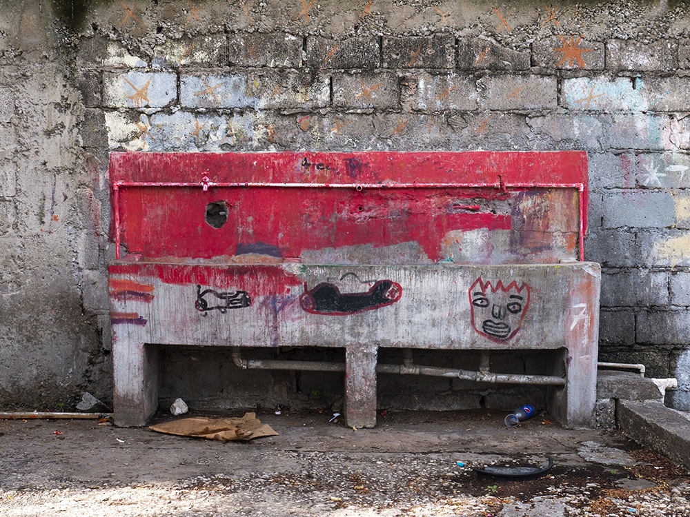
| RED SINK
This photograph was taken during a month-long stay in Trench Town, Jamaica earlier this year. One of my projects was to photograph the community’s remaining communal concrete sinks which are part of the original 1950s architecture.
The recently-graffitied sink was a powerful image, but I hesitated for several days before photographing it purely because that particular colour made me feel so uncomfortable. It was an instinctive and profound reaction, not to the graffiti or to the incongruity of the paint, but to the colour itself.
Whether planned or improvised, unexpected colour within the built environment usually makes me feel elated. It’s one of the aspects of photography that I enjoy the most. This particular shade of tomato-red had the opposite effect.
I met the very engaging person who had painted the sink to ‘lively it up’, and I took the photograph during my final week. Although I find the image humorous and strange, its predominant colour still puts me on edge, and I cannot imagine ever printing it.
I would not consider adjusting the red because my work is documentary and I record what I see.
Charlotte C Mortensson LG
|
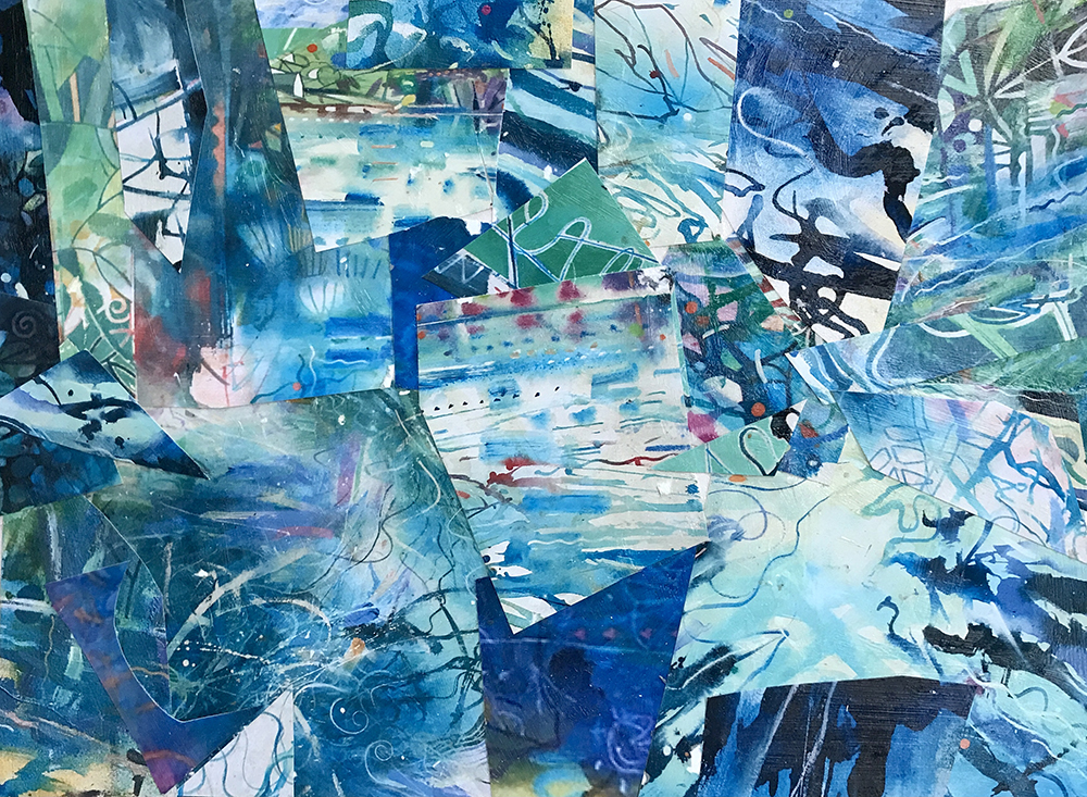
| Singing the Blues
Collage of blues from my paintings.
Cobalt Blue , Powder Blue, Indigo, Manganese Blue, Phthalo Blue, Cerulean Blue, Ultramarine Blue, Deep Turquoise, Turquoise, Cobalt Turquoise, Prussian Blue, Teal, Cyan, Light Blue Permanent, Brilliant Blue, Light Blue Violet, Windsor Blue.
Transparent, Intense, Opaque, Stained, Washed, Fluid, Thick, Sponged, Rollered, Scumbled, Thrown, Delicate, Rich, Printed, Calligraphic, Brushed, Loose, Detailed, Layered, Fast, Slow, Meandering, Flowing, Dark, Light, Textured, Glowing.
David Wiseman LG |
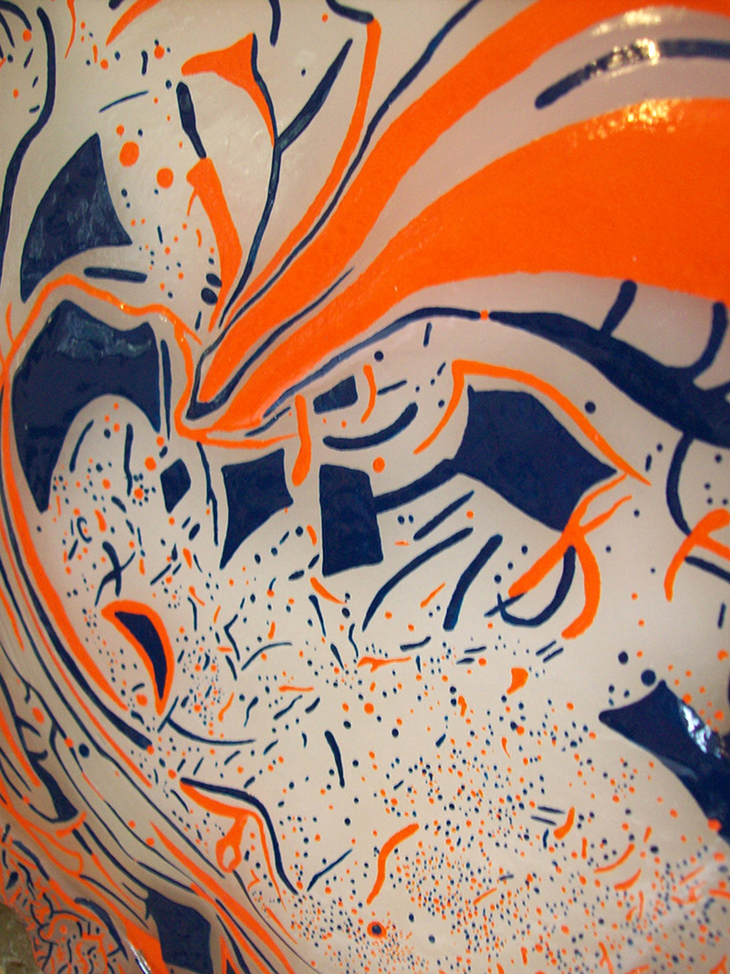
| Contrasting Colours
When Lockdown was introduced back in March it provided us all with much uncertainty. However, I tried to use it as a time to incorporate new excitements to my practice. In order to make this happen I started to develop a new body of work, which included a great deal of colour. I started to research into ‘contrasting colours’. This article will provide a description of the subjects I looked at when developing this new series.
Contrast and Analogy are the principles which define colour design. I focus more on the contrasting between colours because this is what draws visual impact and attention to the eye.
There are 3 main themes, which I look at when creating a ‘contrasting colour’ work. This includes: Hue, Value and Chroma. The starting point is the choosing of the Hue colour to work with, for example: If I select Orange as the Hue Colour, to get the best visual impact I have to impose on this colour, to do this I would select Blue as this is Orange’s opposing Colour on the colour wheel. This means that the work inherits a powerful reading giving the overall design its highest impact when being viewed.
Chis Horner LG
"O & B Contrasting Colours" 2020, 36.2 x 35.2 x 4 cm Mixed media on Canvas
|
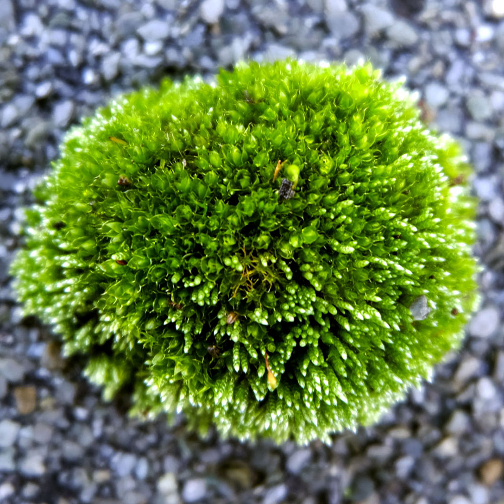
| furry green of moss at midday
florescent vibrant small but lively
velvet soft and soggy
glowing on the tarpaper
Jockel Liess LG |
| I always start a painting by covering the canvas with one colour (often orange), which creates a colour field and with the introduction of the first gesture or form the spatial depth is activated. As I build the painting I enjoy seeing the ground colour shift in it’s space and appearing behind and in front of abstract marks or images. By the time the painting is finished this ground is often not visible. In many cases a new colour will take over and as Bonnard said:
“If one has in a sequence a simple colour as the point of departure, one composes the whole painting around it.”
Gill Ingham VLPG
"Lambency" 2020
|
| ‘ Quince in Sunlight ’
An Ode to Colour.
In the Absence of Light
There is No Colour,
In the Presence of Light
The Eye the Brain Decode Impulses ,
In the Presence of Consciousness
The Heart Soul n’ Spirit Explode,
Exploring Divine Emotions
A Cacophony of Infinite Human Colour.
Clive Burton LG |
| Caerulean/Cerulean Blue…it’s always crucially in the mix in some form whenever I paint…a trick of the sun’s light which gives us the seeable yet non-existent over-arching membrane that seems to enclose us down here and to shut us off from the absolute otherness beyond. It’s against this groundless backcloth that we are able to figure and refigure (seemingly, in art at least, without end…) everything (the all-too-close and the all-too-distant) between ourselves and, simultaneously, between it and ourselves.
But every such figuring-for-art doesn’t give us anything outside art. ‘In lovely blueness’* each can offer us nothing but itself alone and, with luck, a taste of art’s own earth-bound otherness, its absolute difference from everything else we like to think we ‘know’ all too well. Even this possibility can hold only as long as the sun, daylight, and our eyes are somehow still clinging on…
*Holderlin
Michael Phillipson LG |
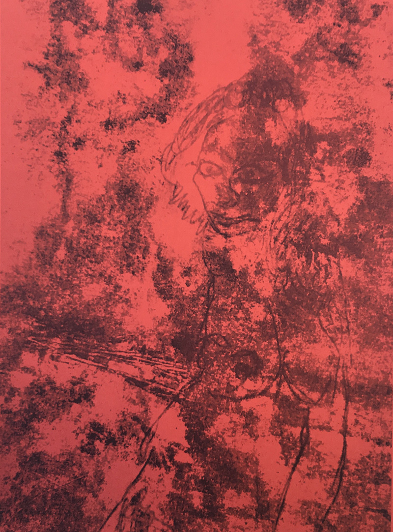
| red red red red colour of blood human greed...
Slavomir Blatton LG
|
| Gold
Some artists would consider gold not to be a colour but merely pulverised metal suspended in a medium, if so then what of the range of cadmium colours, crimson lake, pure ultramarine and raw umber? The colour gold speaks of the sun, warm and life-affirming. Like the sun it carries its own light within. It is an enigma and, as with white, cannot be mixed. Alchemists spent their lives trying to reproduce this precious stuff from base lead, but only the rare explosions of massive stars in supernova detonations yields its golden glow. Gold is gorgeous, does not tarnish, is permanent, incorruptible, infinite.
David Redfern LG
“864 Years”, 27.5 x 41 x 5, gold and paper, 2020
|
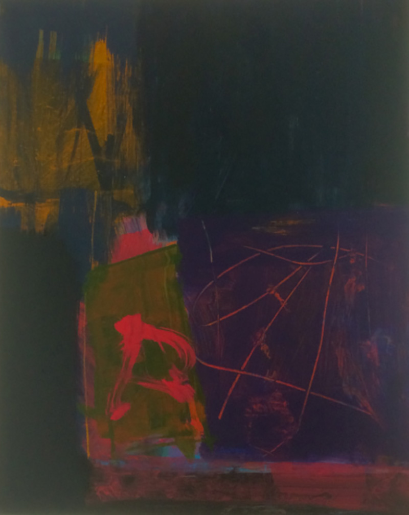
| I don’t like to admit I use source material, but it can creep in. Given a clear night I get out my telescope - Jupiter, Saturn, Mars have all been on show recently. What can you do? Art can’t compete. I also draw in pen quite a bit, trees mostly, unravelling the intertwined branches of an oak, just exercises, training the eye. It all helps.
What is a colourist? Years ago I was an aesthete, worried to the last about this mix or that tint. I am not saying I now throw in any old colour, or get it right, but I have learned to be carefree and trust the accidental. I have been using gouache on a small scale. I can take a rough photo and feed it into a digital version running in parallel. Sometimes I shift the colours about at random. Suddenly it becomes unfamiliar – someone else’s work and better. One surprise in this picture is the rough rectangle in the top right: it was indigo and green in the original, and now it’s a slice of Dundee cake. The blue surround was an afterthought. And yes, it reminds me of looking at the night sky.
James Faure Walker LG
"Seeing Saturn", 2020, 49 x 56 cm, archival inkjet print
|
| Yellow is an uplifting colour. It fills one with hope , warm and infused with light supplying both dark and lighter content with life endorsing force.
Julie Held LG |
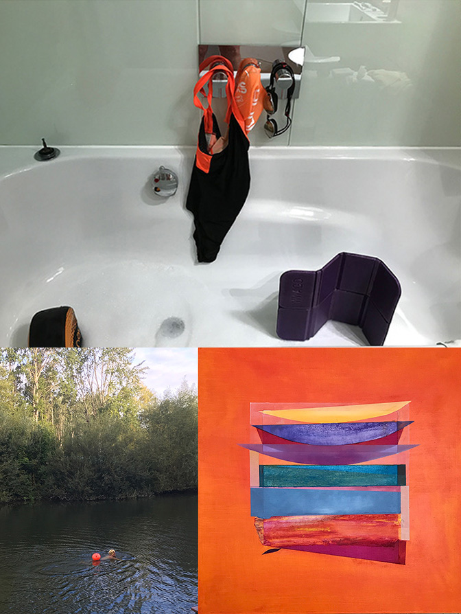
| Orange it is - whether swimming or painting.....
Philippa Tunstill LG |
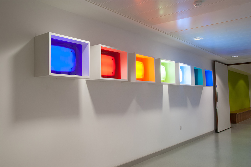
| '70,000 Lux'
An installation comprising seven wall-mounted boxes, each containing a S.A.D. (Seasonal Affective Disorder) light, fronted by coloured transparent Perspex in the hues of a rainbow, a symbol of hope.
The lights are activated by motion sensors, greeting the viewer with intense light and bright colours when she walks through the space. They invite the viewer to consider the effects of light and colour on emotions and wellbeing. It was inspired by the experience of working with mental health service users during an artist residency at Springfield University Hospital, London, supported by Arts Council England, 2010. 70,000 Lux is in the hospital’s permanent collection.
https://ericfong.com/albums/70000-lux
Eric Fong LG
"70,000 Lux", 2009
|
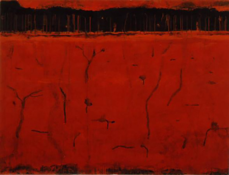
| My work has always been about colour
Colour has always been an integral part of my work. Perhaps because of the tradition I come from ie Scotland, well known for its colourists, although I was not trained in that tradition.
Colour is apparent in most of my paintings and artworks and is a natural instinctive process. This painting ‘Desert Place’, mixed media on paper (92 x 120 cms), is simply composed of red and black. The colour is symbolic. Colour, for me, gives a whole underlying meaning to the essence of the artwork.
Janet Patterson LG
Desert Place mmp 92 x 120cms
|
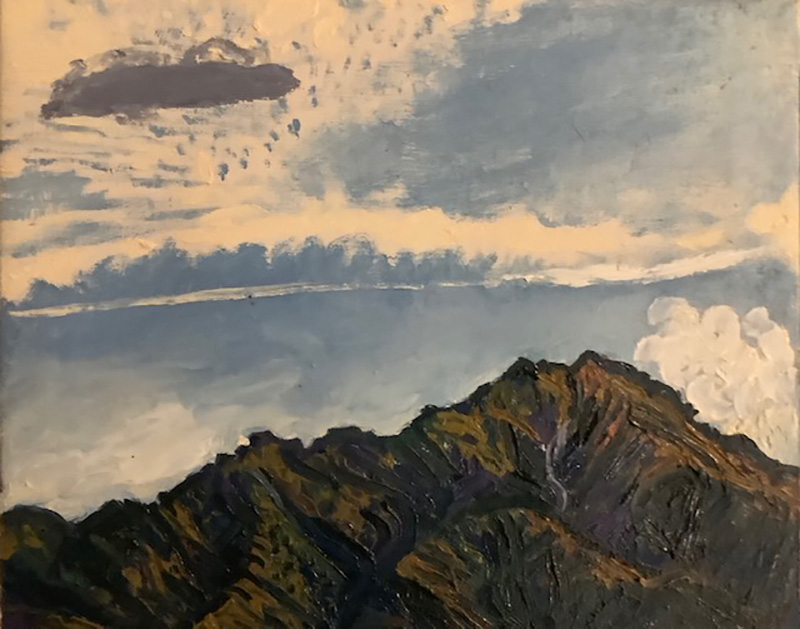
| Prussian Blue
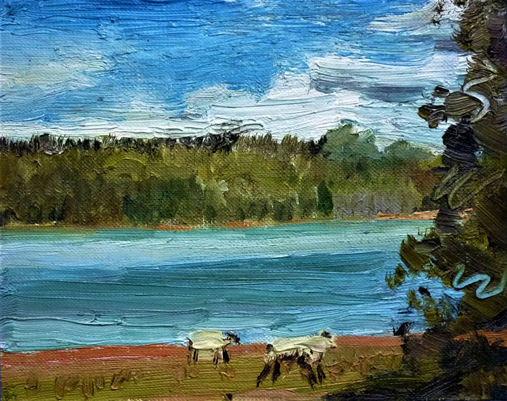
Is the colour as kids we longed to see, as the family drove in a cream holden car over the Hundalees to Kaikoura for our summer holidays camping in a paddock, by the sea at The Point, Kaikoura. I still love and use this colour. The South Pacific is sharp, bright, clean, vast, powerful, and full of life. Albatrosses, seals, crayfish, whales, huge pods of dolphins cruise the deep unknowable waters. In the car wed shout”The sea!the sea! “ it was hard work to drive this big heavy car over narrow winding roads in heat. At Goose Bay my father would stop, leap out of the car, race to the sea, fully clothed and sit in it, loving the colour, the huge swell, the endless Prussian blue, blue all the way to Peru.
Susan M Wilson LG
“Four Peaks” 12” x 10” oil on linen 2018
|
| Extremely difficult to put into words how I feel about colour and deciding what to present here or even write about is like pulling teeth!
I don’t have an affinity with one individual colour but colour combinations do have an emotional affect.
Where I grew up colours defined us and 'kept us in our place’.
So talk about colour brings up a lot of conflict in me.
The image presented here hopefully says more about how I feel about colour these days.
Martin Heron LG |
| Pink, actually a fluorescent pink but slightly desaturated.
In Chromophobia David Batchelor writes of ‘the many and varied attempts to purge colour from culture, to devalue colour, to diminish its significance, to deny its complexity.’
Perhaps Pink is a good example. He goes on, ‘this purging of colour is usually accomplished in one of two ways. In the first, colour is made out to be the property of some ‘foreign’ body - usually the feminine, the oriental, the primitive, the infantile, the vulgar, the queer or the pathological. In the second, colour is relegated to the realm of the superficial, the supplementary, the inessential or the cosmetic. In one, colour is regarded as alien and therefore dangerous; in the other, it is perceived merely as a secondary quality of experience, and thus unworthy of serious consideration.”(1)
As is well known Pink was the colour of the inverted triangle ‘badge’ that LGBTQ+ prisoners in Nazi concentration camps were forced to wear.
Artist paint manufacturers continue to make paint they describe variously as ‘Flesh Tint’ or ‘Flesh’. This is always a variation of pink. More recently I have seen it qualified by the word ‘Caucasian’. Like that makes it better!
Ian Parker LG
(1) David Batchelor, Chromophobia, London: Reaktion, 2000, p. 22-23.
https://davidbatchelor.co.uk/books/chromophobia/ |
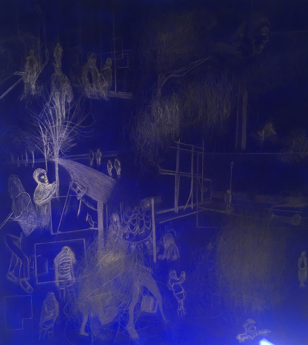
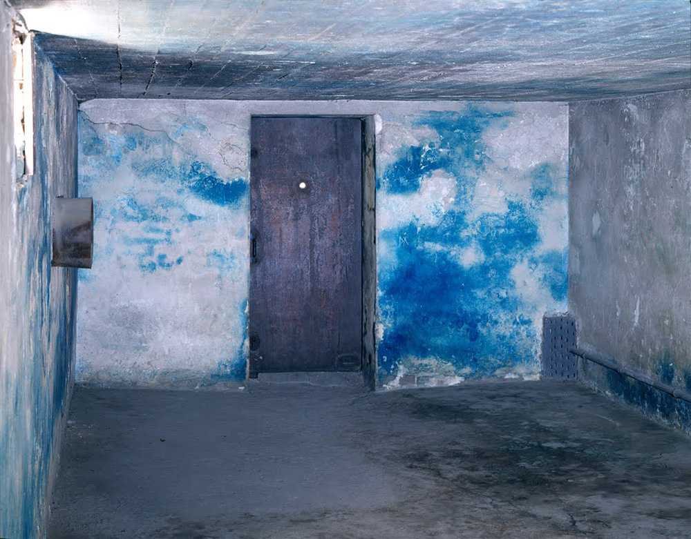
| This painting; Where have you been hiding? was made during our current pandemic between August and November in response to a film I am currently making titled; London project. This blue work, followed one in deep red that hangs on the adjacent wall. Both hues allowed my studio to become a space of much solace and vivid enrichment for me. I felt able to soak in the colour and light. It helped me to connect to my memories of an energy and living presence so missed.
Erika Winstone LG
"Where have you been hiding?" silverpoint, acrylic, canvas. Aug - Nov 2020 5ft x 3ft
|
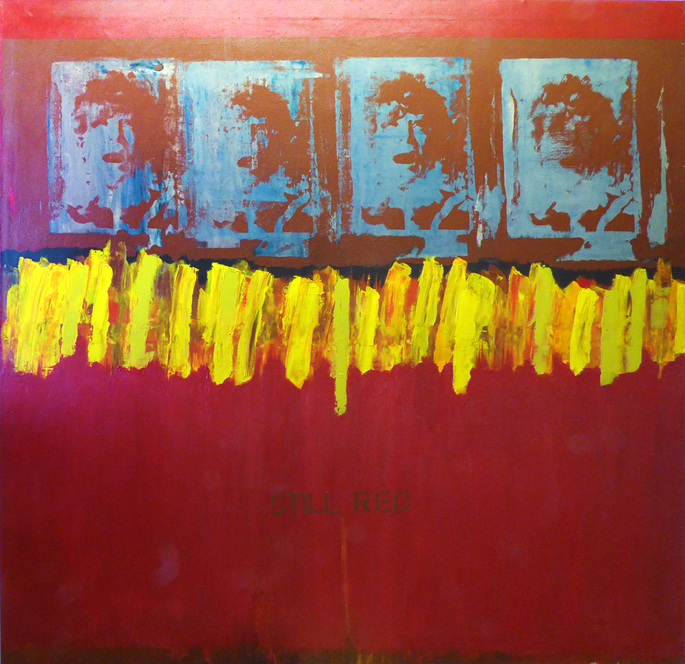
| The colour is Carmine Red.
I love this colour and use it frequently.
Title "Still Red" Acrylic on canvas 150 cm x 150 cm
Silk Screen photographic images of my face and text.
1992
Please refer to Mike Phillipsons article in my catalogue "Tell me no more lies" which is on my website. This discusses the aesthetics, politics and ideas behind the
painting.
Suzan Swale LG
www.suzanswale.co.uk |
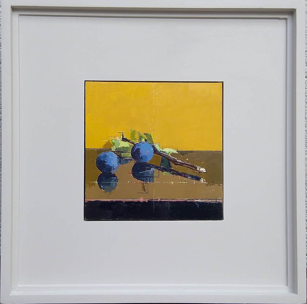
| 'Light is therefore colour' Turner 1818
Seeing and believing colour is mysterious, a fleeting sensation. Trying to 'identify' and pitch 'mixtures' in relation to what is seen and imagined is very difficult. Drawing helps me see and understand colour and the idea pushes my emotional response; often the colours for things are not what I think they are or 'should be'. This picture became about the 'yellow' light and how the lid of the 'black' box was dramatically altered to reflect and engulf the bloom on the plums, whose colour was very different but still in the same space and air.
Mark Dunford LG
"Kea Plums, Yellow" oil on panel 15 x 15 cm private collection
|
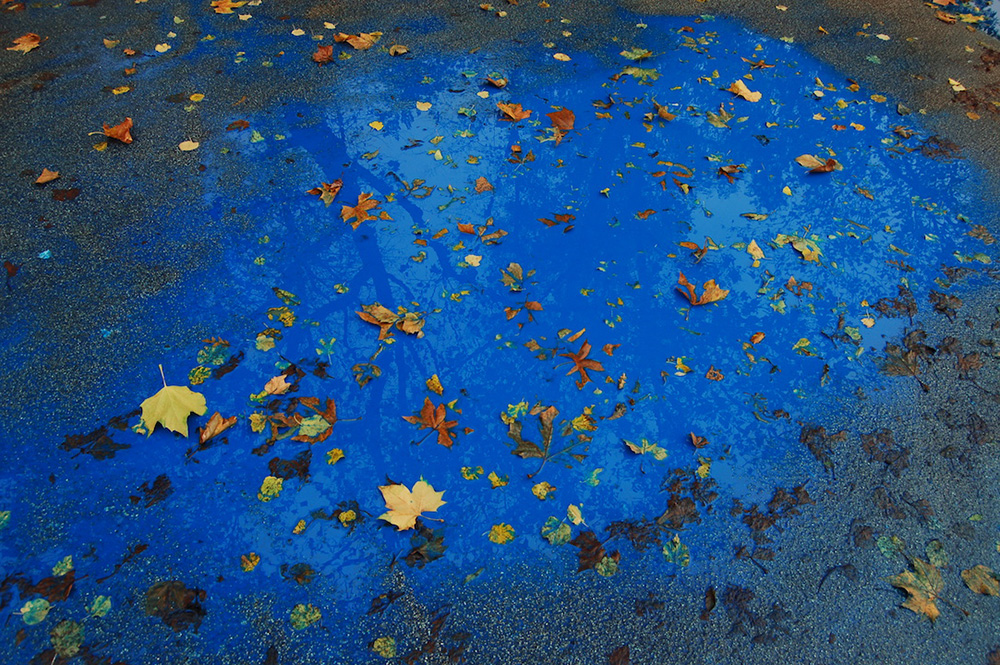
| 'Nothing but Blue Skies' was made by adding blue paint to a puddle on a grey day.
Maya Ramsay LG |
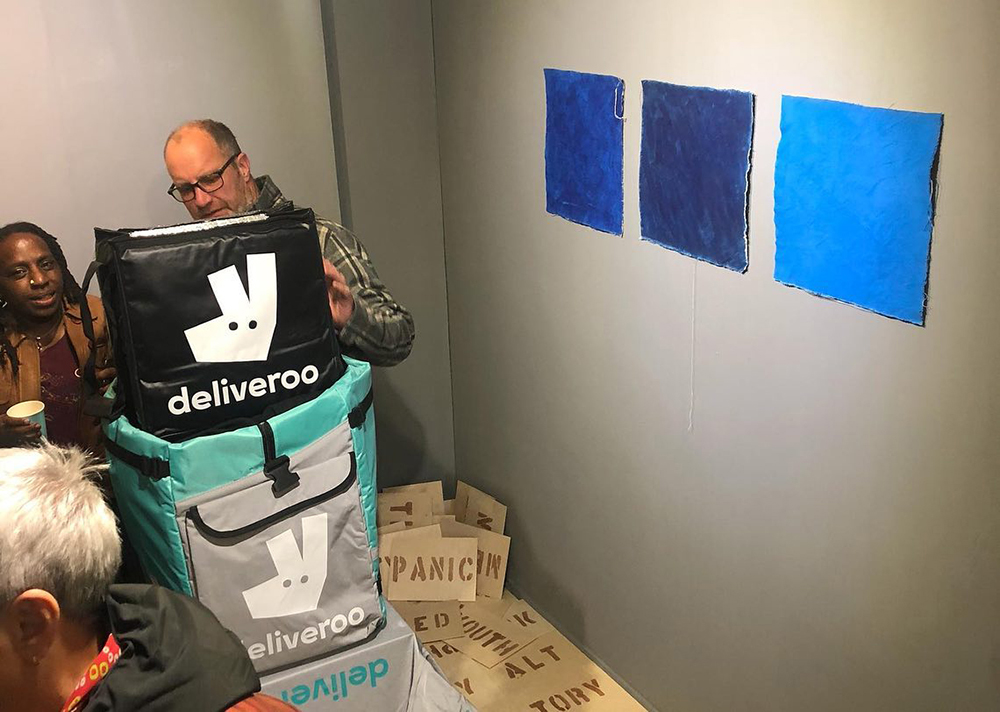
| Robin Egg Blue
Oh Robin Egg Blue how I do love you,
And did, long before Deliveroo.
Is it turquoise or something new?
Yves Klein mocked the idea of patenting a blue… too.
(Has the food delivery corporation managed it?)
Anyway, this colour was one of my faves from childhood, thanks to a toy system I was given which encouraged experimentation. Small objects could be set in a kind of plastic or Perspex, transparent on top but with colour an option, typically to use for the background. The emphasis was on creating jewellery of a sort. My memory of it is vague, but I often opted to simulate turquoise, defined by Wikipedia as ‘an opaque, blue-to-green mineral that is a hydrated phosphate of copper and aluminium, with the chemical formula CuAl6(PO4)4(OH)8·4H2O’. I have not got the exact chemical formula for the plastic to hand, but that will be hydrocarbon based (i.e. beautifully organic). Details for the new colour:
Name: Robin Egg Blue
Hex: #00CDBC
RGB: (0, 205, 188)
CMYK: 1, 0, 0.082, 0.196
Recommended reading:
Leslie, E., 2005. Synthetic Worlds: Nature, Art and the Chemical Industry. Illustrated edition ed. London: Reaktion Books.
Micheál O’Connell LG a.k.a. Mocksim (always mocking simulation)
www.mocksim.ie
|
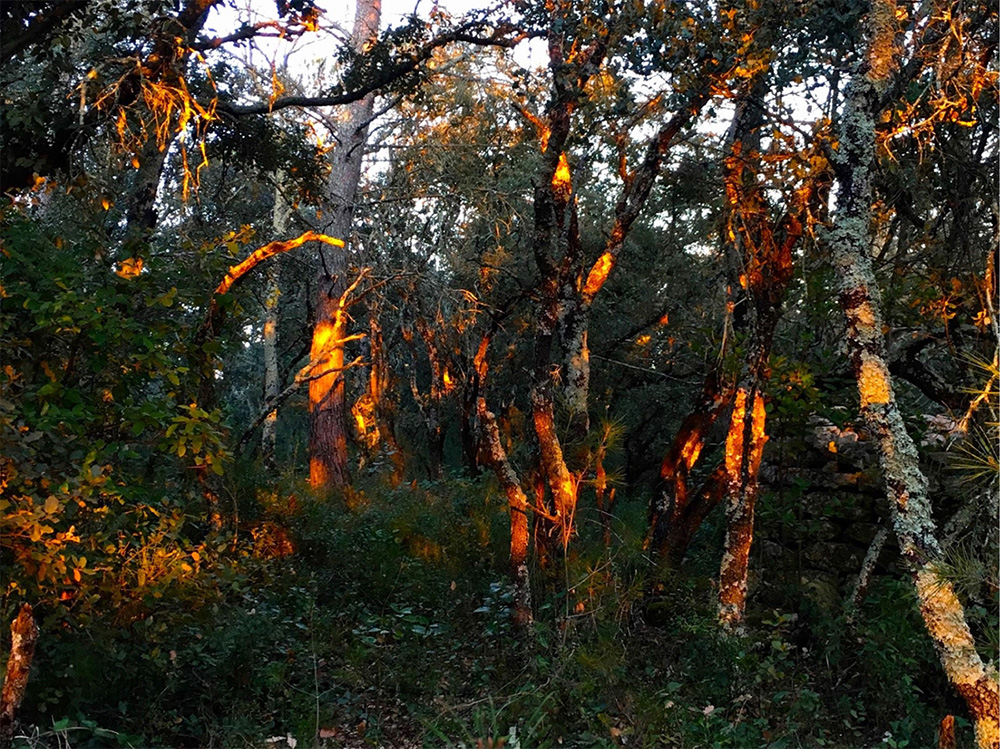
| Fluorescent Orange.
Colour for me is either the primary beginning of a work or it is the ending element, being placed over the work. I find it easier to work with ideas and line as first element. Then colour comes from those ideas.
it is this super imposing of an entirely independant colour that I find interesting.
I want colour to hover in my work, to occupy a space between the viewer and the subject
One of my favourite colours is fluorescent orange. I like this audacity, this ping of colour. It has for me a place in the natural perceptual world - a golden moment of more intense light in the winter months where the forest is punctuated with holes of unreal orange piercing through the trees.
Fluorescent orange is the only thing I have found that comes close to this perceptual shock in the studio. It was this phenomenon that was the basis for a sculptural piece “Chemin”.
As artists in residence Susan Dalladay and I were commissioned to make 3 works for “La Bambouseraie” in the Cévennes in 2018.
“Chemin” juxtaposes light, colour and form on the forest floor.
The hot tones of yellow through to red/purple, painted on 450 bamboo ends were placed ,forming a circle under the tall bamboo trees. The bamboo sways, allowing sunlight to hit the colour circle at different points and places creating a flickering colour spectacle through the trees.
Victoria Arney LG
www.victoriaarney.com
"Chemin" |
| I use blue a lot in my paintings; I once made a painting called Big Blue.Blue is nature’s colour for water and sky. My clothes are often coordinated blue. Some of you may have seen me sporting a signature blue fedora hat, a blue jacket and blue shoes. Blue is associated with spiritual healing and is linked with calm and serenity. It helps lower blood pressure. I’m told that I’ve got a blood pressure level to die for! Apparently, blue is the colour of intuition, inspiration and inner peace. I used to run workshops training people to develop their intuition as a skill. Blue is linked to the Throat Chakra, clairaudience and spiritual philosophy. I am passionate about a paradigm of spiritual Self-enquiry called Non-Duality.
On another tack, most of my mother's family were gassed in the Holocaust with Zylon B which happens to be blue. The brand of Zyklon-B used by the Nazis contained substances which gave the pellets a blue appearance and left blue stains inside gas chambers which can still be seen today in chambers that were left intact. So another layer of meaning is remembrance of that terrible time.
Moich Abrahams LG |
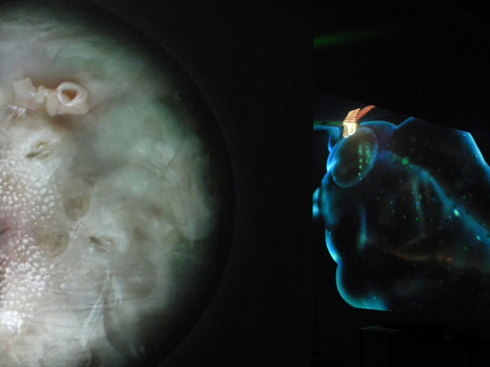
| Bioluminescence is a process whereby animals emit coloured light from within their body. Typically blues and greens. In the vastness of the ocean abyss it may be the most common form of communication. The light display may entice a meal or a sexual partner or confuse an incoming predator. Or perhaps these 'living canvasses' just enjoy putting on a display.
Genetic Moo LG
"Cockatoo squid" on the right.
|
| There was a famous quote by Cezanne when he said: “Colour is where the mind and the universe meet”.
I have never understood colour, other than as something irrational and subjective. I see it as a secondary property to primary principles of shape, weight, size and mass. These I can feel in the dark as well as daylight. Colour is ephemeral and changeable, mostly when seen under different light conditions and circumstances, how colour can be perceived at any time, under other physical conditions, changes. Also depending on how you see colour, on which species you belong to on this planet. Whether the colour is additive or subtractive, seen on a screen or a surface. You get surface colour, atmospheric colour; a single colour changes all the time, relative to which colours are adjacent. Everyone will have in their minds-eye a different concept of what they consider to be a true red, a true yellow or blue. A red with no hint of yellow or of any blue, which is a personal experience I have yet to discover. This idea for me, a pure colour, is just too Platonic, too much like the “view from nowhere”.
The history of naming colour is fascinating because in the past colour was less important to people. Ancient Greek texts have strange colour descriptions. In Homer’s Odyssey, the blue sea has been referred to as wine-dark. Historians conclude the word blue did not then exist. It was not important enough to have its description. The first colour words, in most languages, were white and black then red, of blood and wine, followed by yellow then green. Blue appeared last. If you ask a young child, who has never been told the sky is blue, to describe its colour, some will describe it as colourless or white. Early humans did not notice the colour blue.
And yet, subjectively, I find my colour range, when I paint, has always tended toward the blue spectrum smattered with red, a cold and warm temperature change that seems to rise deep within me. I do not feel comfortable wearing bright yellow or green clothes, though I love the ethereal quality of purple. Colour goes deep within my bodily sense of self. The nuances and wide variety of greens in nature, the razzle-dazzle of neon-strip lighting, all are part of my world within my culture. Colour signage such as red for danger or colour green for go, I could not exist without the beauty and mystery of colour in my life or imagine a life without the vast multiplicity of colour applications. From the practical, even political, to the aesthetic.
Peter Clossick LG
"Bewl Water" |
| FEELING THE BLUES… Colour is obviously a subjective feeling and an idiosyncratic response despite the science and the statistical surveys that yield a general statement. However, blue by it’s ubiquitious distribution in nature (the colour of the sky & sea) is a popular colour that symbolizes trust, loyalty, wisdom, confidence, stability, cleanliness, health, faith, truth, tranquility and calmness. It also represents knowledge, power, integrity, and seriousness. Probably the reason why it is most commonly used in hospitals, for uniforms (the military and police), for corporate branding and identity etc. Studies have demonstrated that offices decorated in blue have increased productivity. Ironically artists & musicians relate blue to feelings of sadness & aloofness. When Isaac Newton refracted a light beam through a prism in 1672 to separate into the spectrum of 7 colours, there were immediate parallels drawn between music notation too-the notes of an octave. Feeling The Blues: a multimodular interactive site-specific light installation of mixed media assemblages, could contract and expand to variable dimensions. It was shown simultaneously at the Cello Factory, the Arts Pavilion of the Whitechapel Gallery, inside and outside on the roof, within the train (video) and the public invited to interact & change it’s configuration. Also shown at the 40th Anniversary of the Megaloprint Studio, Australia & Central Booking New York: Capital Gains. Sumi Perera LG "Feeling the Blues" video still |
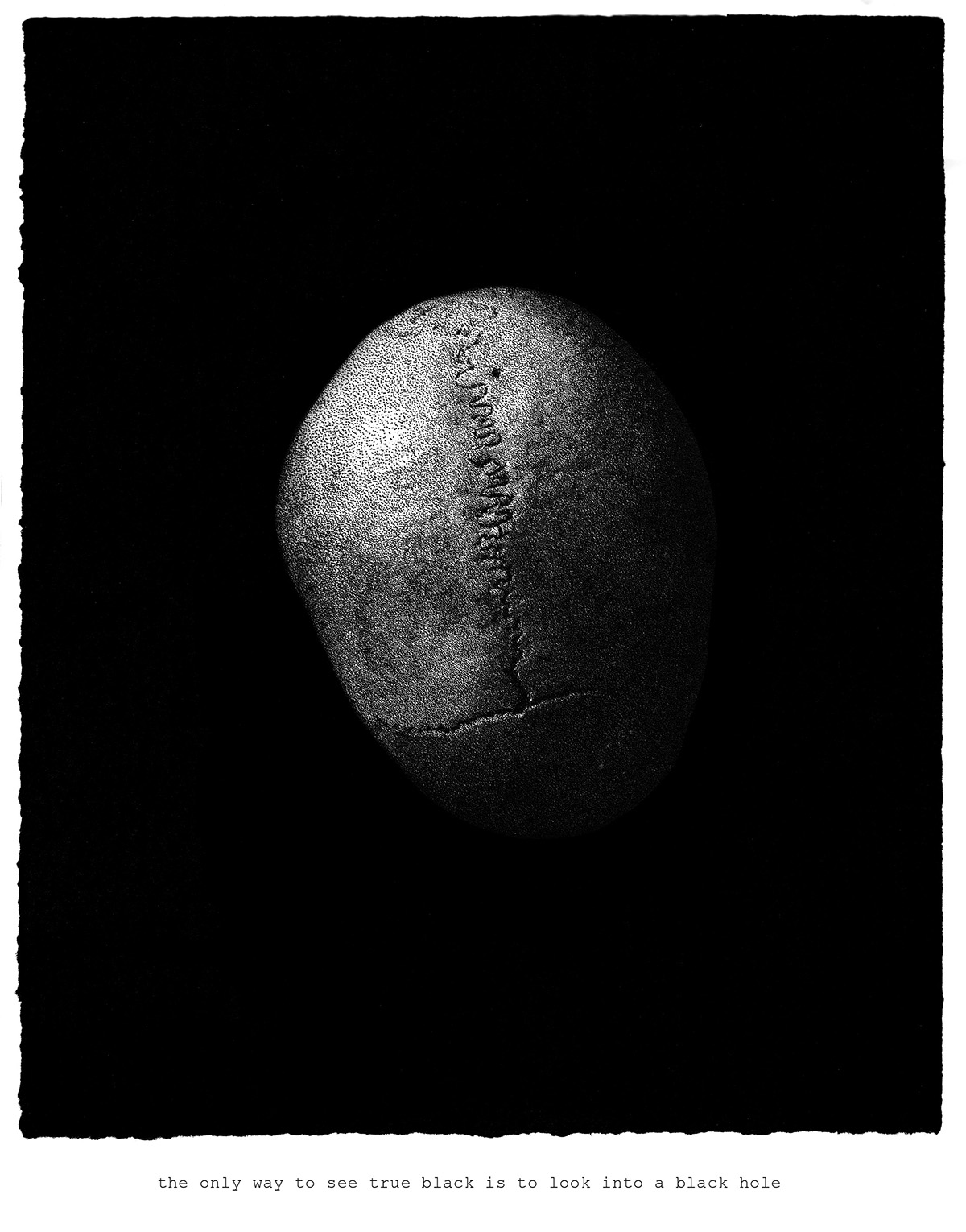
| the only way to see true black is to look into a black hole.
Carol Wyss LG |
| |