We’re all excited about the new London Group logo. Let’s hear about its creation from the designer, Bob Young.
.
As a design company that prides itself on bringing together a diverse range of creatives who specialise in different mediums, we feel a strong connection to the ideals of The London Group and the spirit in which it was founded. But to create a visual identity for the collective that feels like a reflection of what it stands for, we knew we had to look beyond its historical achievements and focus on where it could go in the future and the audiences it wanted to connect with.
The London Group team have been fantastic to work with throughout the project. Well researched and willing to engage in the process. We had many constructive discussions around what makes the collective unique and its ambitions for the future. It seemed clear to us that many of the answers from these sessions explain the ongoing longevity of the Group.
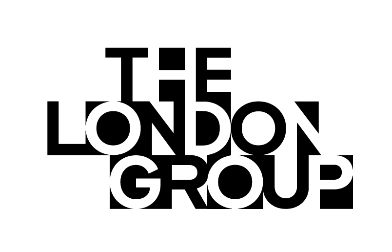
‘A triumph of collective endeavour’ this is a line that we kept returning to through the whole project. Uncovered during research into the London Group’s archive, it was used to describe the collective’s opening exhibition in 1913. It perfectly describes the strength in diversity the group cultivates and the amazing things that happen when artists support and inspire each other. It’s this unique connection between the characters of the group that inspired the new logo-mark and generated the core to the overall visual identity. We took each letter from ‘The London Group’ name and began to focus on the connecting areas between the letters – the space between the characters was where all the inspiring and unusual shapes were hiding. We knew that by highlighting these shapes, not only in the logo-mark, but throughout the identity as a whole, we would be celebrating the unique creative connections at heart of the collective.
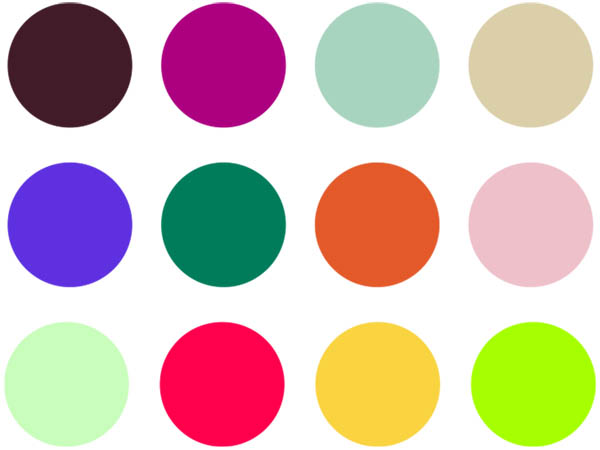
We believe the final visual identity we’ve created together with the Design Committee is something exciting and truly different, combining the new logo-mark with a vibrant colour palette, modern type styles and a flexible system for the whole team to use and explore.
The recent Bankside exhibition was the first reveal of the new identity, and we couldn’t be happier with how it’s come to life. We are actively working with the group now, to ensure the identity can thrive to allow The London Group to continue to blaze a trail for all the art world to follow.
Bob Young, 2022
www.alphabetical.studio
Alphabetical are an independent graphic design studio based in London. They have over a decade of experience in creating powerful branding and communications for some of the world’s leading change-makers, including; Marks & Spencer, The Guardian, Amazon and The United Nations.